
LEARN · CHART COMPARISON
How to compare stock charts across time
To compare price paths from different eras, align equal windows and convert both charts to relative performance. Otherwise, differences in price level and date range can create a misleading visual match.
By ThenPath · Published October 4, 2026
Two different meanings of “compare stock charts”
Chart platforms usually compare two securities over the same dates—for example, Apple and Microsoft over the last year. That answers which asset gained more during one shared period.
Historical pattern comparison asks a different question: does one asset's recent path resemble an earlier path in its own history? The calendar dates and price levels differ, so both paths must be aligned before their shapes can be compared.
| Comparison | Example | Useful for |
|---|---|---|
| Same dates, different assets | AAPL versus MSFT in 2026 | Relative performance and co-movement |
| Different dates, same asset | PLTR now versus an earlier PLTR period | Historical analog and path-shape analysis |
Step 1: use equal comparison windows
Choose the number of observations first, then apply it to both periods. A 90-session recent path should be compared with 90-session historical paths—not a hand-picked 70-day or 120-day segment that happens to look better.
For exchange-traded assets, observations are usually trading sessions. For continuously traded crypto, they may be calendar days. Mixing those conventions changes the amount of real time represented by the chart.
Step 2: normalize both charts
Raw prices cannot be overlaid fairly when one period trades near $20 and another near $200. Rebase each series to a common anchor:
Normalized value = price ÷ anchor price × 100
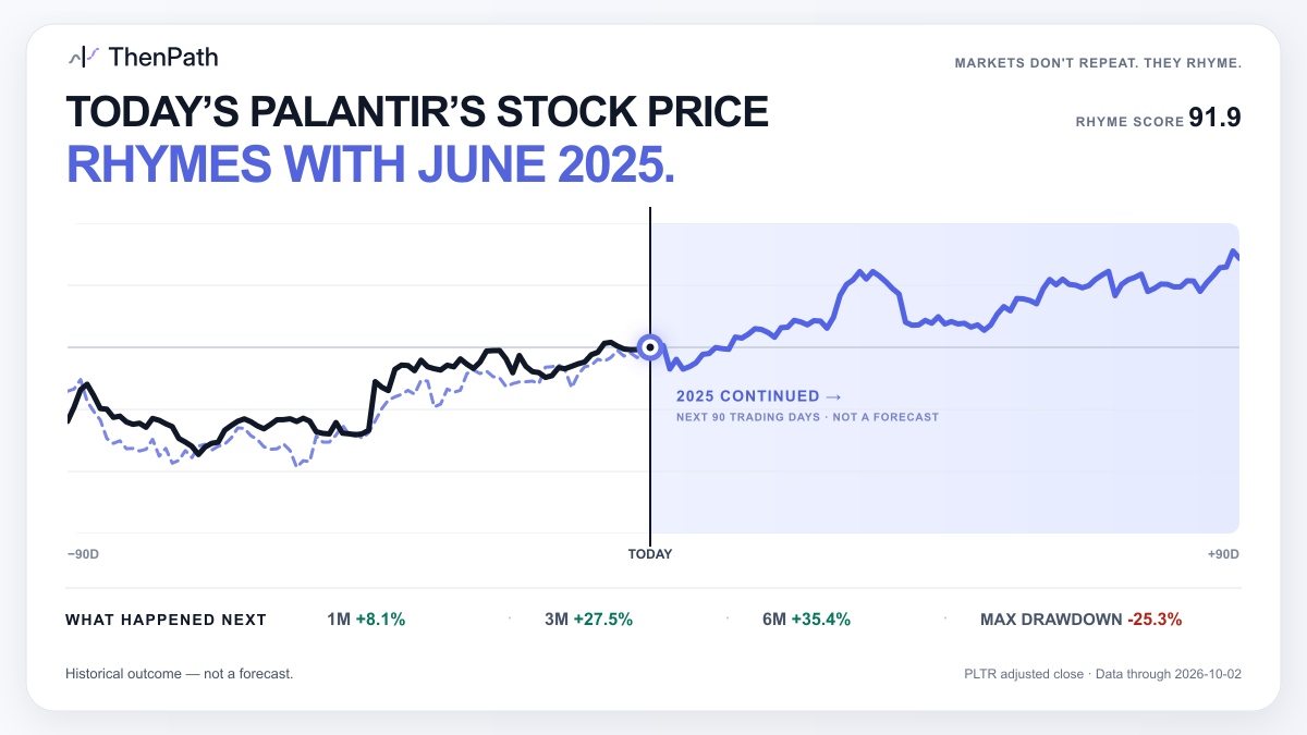
Choose the anchor to fit the question. To compare forward performance from two dates, set each period's first observation to 100. To compare the paths leading into two endpoints, set each endpoint to 100. ThenPath uses the second method: “today” and the historical match endpoint meet at 100.
Step 3: measure similarity consistently
A visual overlay is useful, but it invites subjective cherry-picking. A repeatable process scores every eligible historical window using the same rule. ThenPath uses Pearson correlation on the normalized paths.
The NIST definition of correlation describes the Pearson coefficient as a measure of linear relationship ranging from −1 to +1. A high correlation means the paths moved together in a similar sequence; it does not mean their later returns will match.
Other reasonable similarity methods include Euclidean distance, dynamic time warping, or return-based distance. Different methods answer slightly different questions, so disclose the rule and keep it fixed.
Step 4: separate matching from outcome
The historical continuation must remain hidden while candidates are ranked. First select the matching window using only information available through its endpoint. Only then reveal the later return and drawdown.
If you inspect the outcome before choosing the match, future information has leaked into the selection. This is look-ahead bias: the chart may still be attractive, but it no longer represents a clean test.
Step 5: compare context, not just shape
Two price paths can look nearly identical while the forces behind them differ. Before drawing a conclusion, compare:
- volatility and maximum drawdown;
- interest-rate, inflation, and liquidity conditions;
- the company's earnings profile, valuation, and capital structure;
- major news, index changes, splits, or acquisitions; and
- whether the result survives a different reasonable window length.
This context is why an analog should be treated as a historical case study, not a price target.
A practical comparison checklist
- Equal length: both paths contain the same number of observations.
- Same scale: both series are rebased to a common logical anchor.
- Fixed rule: every candidate is scored the same way.
- No overlap: the historical window is genuinely earlier and independent.
- No future leakage: continuation data does not affect selection.
- Downside included: drawdown is considered alongside ending return.
- Context stated: important similarities and differences are visible.
What a chart comparison can—and cannot—tell you
A well-constructed comparison can show that a present path has a close historical precedent and document how that precedent unfolded. It can also expose alternative scenarios worth investigating.
It cannot prove causation or convert one historical outcome into a probability. The SEC's guidance on performance claims emphasizes that past performance does not necessarily predict future results and that methodology and market conditions matter.
For the broader concept, read what a stock market analog is. For ThenPath's exact eligibility rules, scoring, and outcome windows, see the methodology.